 hsjobeki
Did LLMs get better at producing good UX?
I compared Opus 4.6 with opus 5
For coming up with the methods I started by generating a prompt in the claude web UI.
I had previously built some Apps for myself using Opus-5 and was frustrated about the results. Things that felt obvious for me were wrong. The layout didn’t line up, functionality was missing. And the designs I handed to the model in order to fix it were only implemented by 80%.
That morning I had a discussion with @DavHau about whether LLMs are better now than earlier this year. My personal feeling was that the code has fewer bugs, but logic is often wrong or missing and the designs look generic and feel sloppy.
I transferred the prompt into my local oh-my-pi harness and started a planning session. After I was satisfied with the plan. I started the execution in a fresh context.
The plan it came up with was roughly this shape, following the idea I had already built:
Let 2 different models build the same apps then compare and rate them in a blind test. As rater I planned to use fable 5 because i hoped it would catch more subtle mistakes than a dumber model.
The plan contained 54 app-pairs in total:
3 times the same prompt for:
- Spreadsheet tool
- Job queue admin
- Health dashboard
- Welcome screen
- Checkout form
- Settings page
The main agent was opus-5 orchestrating up to 18 parallel agents building the apps in separate local folders.
One of my complaints was weak async understanding. So the apps included a dummy backend to simulate waiting for a server. Each app was minimal but functional.
The first generation run went to the bin. The builders were asked to return the HTML inside a JSON answer, and 3 of the 18 opus-4-6 builders lost their whole document on the way. One broken JSON, two empty answers. opus-5 lost none. So all builders got a write-file tool instead and all 36 apps were regenerated. Side finding: opus-4-6 loses large documents inside JSON tool calls, opus-5 doesn’t.
After roughly 3 hours it had burned through my entire 20x claude max token budget. 27 of the 108 were still unfinished. After another 1hr of waiting those were done too.
Finally the results were there!
I thought so but the real work had only started :D
To take the most important finding away from the end: My methods made it too easy for the LLM to cheat on me, there was a problem with the test harness and the evaluation methods made it possible to cheat for both human and LLM raters.
Looking at the results fable-5 preferred opus-5 in a blind rating by 100%. I was stumped. Is opus-5 really that much better?
So i asked claude to let me rate the apps because i didn’t trust the fable results. One failure mode i feared at this point was that fable-5 simply prefers its own output. That was observed earlier and now i feared it would also translate within the model family.
- Thesis: opus-5 <-> fable-5 like each other
Comparing the app pairs by hand i started noticing that there is a certain type of app that you just always get. A simple prompt asked 3 times seemed to produce the identical app. Not by code - but by design. We later measured that the code was entirely novel on every prompt. But the design had a clear handwriting of the model.
I ignored that fact in my head i presumed type-1, which preferred yellow-ish background must be the older opus-4-6, while the clean and more lightweight design must be the more modern opus-5. Turns out - my idea was wrong again here. Interestingly almost all dashboards were in dark mode, no matter the model.
After rating 32 pairs i came back to my agent and reported that all apps look the same somehow. We then aborted rating the rest of the set and settled on finalizing the findings.
Finding 1: fable-5 simply prefers opus-5
fable-5 picked opus-5 in 54 of 54 pairs.
I rated 32 pairs blind myself and picked opus-5 in 56% of 25 (the remaining 7 were ties). We agreed on 14 of 25 pairs, thats also 56%.
We dont know the reason. Using fable-5 to rate output of opus-5 will lie in comparison to a human rater.
The 1-5 rubric ratings have the same problem from another side: fable always scored 4 or 5 on 36 of 36 apps in four of five dimensions. I later found that LLM raters are known to avoid the bottom of a scale regardless of what they’re rating. It doesn’t want to give out bad rates, even if a human would.
Finding 2: Cost differs by factor 8x, 7.58$ with opus-4-6; 57.24$ with opus-5
Both generators were configured absolutely identical; yet produced the same visual results.
So if opus-5 was 8x more expensive, you would get less bugs and better UI right?
Well:
opus-5 spent a lot of effort for thinking and for useless aria accessibility attributes (60x) although it was configured with the same thinking level.
But there was also a problem in the test-harness that led to increased token burning in opus-5 in comparison. The harness gave the builders a write-file tool but no edit tool. opus-4-6 didn’t care because it wrote every file exactly once. opus-5 wanted to change things, and without an edit tool every change means retyping the whole 45KB file. It retyped 1.4 million characters. Roughly a third of the opus-5 bill.
Surprisingly opus-4-6 did not iterate on the apps. It just one-shotted them.
opus-5 instead wrote itself test scripts - verify.mjs, interact.mjs, drive_fail.mjs - started 38 of them against its own apps, read the logs and rewrote. 16 of its 18 apps were written more than once. Nobody asked for that. I also checked whether the 18 parallel builders were talking to each other instead: zero messages, every builder only started its own tests.
opus-5 produced 79% larger files than opus-4-6. Containing 60x more aria attributes than opus-4-6, but the feature coverage is the same. opus-5 calls 1.13x the distinct backend methods of opus-4-6. Both models wire up roughly the same set of operations from the same mock API.
The extra bytes you pay for are not some extra features
Opus-4-6 prefers to handle errors locally, while opus-5 prefers to create more css and icons. Icons make customers more happy than error-handling you know? Its also important to give our rotted-brains more instant dopamine. We could speculate that human raters involved in the LLM training skewed the models towards early dopamine yield - but thats it; a speculation.
The aria attributes changed almost nothing by the way. opus-4-6 already names 98.7% of its buttons with visible text, opus-5 reaches 99.7% with hidden attributes. 60x the html attributes for one percentage point. Which was never a requirement anyone specified. But its nice that every opus-5 generated page has now 1% improved screen-reader support by default, thank you anthropic 🙏
Both models are on par with shipping dead css. Roughly 28% of the css they ship doesn’t affect anything. CSS affects styling and placement of html elements but css that doesn’t target anything costs the user extra site-load time. It hopefully gets stripped if you have a modern css-postprocessing setup. As in most llm generated sites that remains a whish.
So is the extra cost justified? Judged on what a person notices in a side-by-side comparison, the money bought nothing. Judged on the code, the money bought twice the buttons, 1.8 times the graphics, and 1% of better screen-reader capability nobody asked for in a dashboard app.
The honest summary is that opus-5 was doing a different job because it iterated on the apps, rather than one shotting them. Which burned all the additional tokens. Some parts it iterated on were meaningless and self-imposed in this case. Usually I would say it is good if the model derives acceptance criteria and iterates on them. In this case it was just not worth it, because the task was too easy. So we can blame layer-8 problem here. Although how should I know what opus perceives as complex App - that requires a feedback loop? Aria-attributes for this case a pointless tax - for a real app - maybe worth the extra mile.
Finding 3: opus-5 verbosity carries over into the UI
- 13 buttons on average against opus-4-6 5.5 on average. That helps information dense screens but hurts other use-cases.
- Opus-5 built the shittiest welcome screens. Honestly I thought it was opus-4-6 in the blind test because the layout was broken all over.
Interestingly I preferred all 6 welcome screens from opus-4-6 over the ones from opus-5
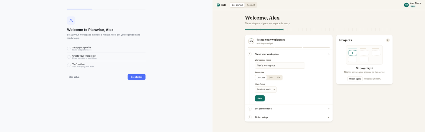
Left opus-4-6, right opus-5. fable-5 rated the right one higher. I rated the left ones higher because the opus-5 driven ones allowed bypassing the registration and going directly into your “Account” although at this point you cannot logicaly have a profile yet, because you are just short of registering yourself. Also the designs from opus-5 had these notable background stripes behind a green-bar which looked like some artifacts of the partyly dead css.
The checkout form was a close call because i liked the lean design of opus-4-6, but liked the ability to delete or add more items to my shopping cart that opus-5 built.
Although the elements were flowing in a weird way, and were not accessible for touch on the mobile view. opus-4-6 didn’t have that problem because it didn’t generate the elements in the first place. Which also worked fine.
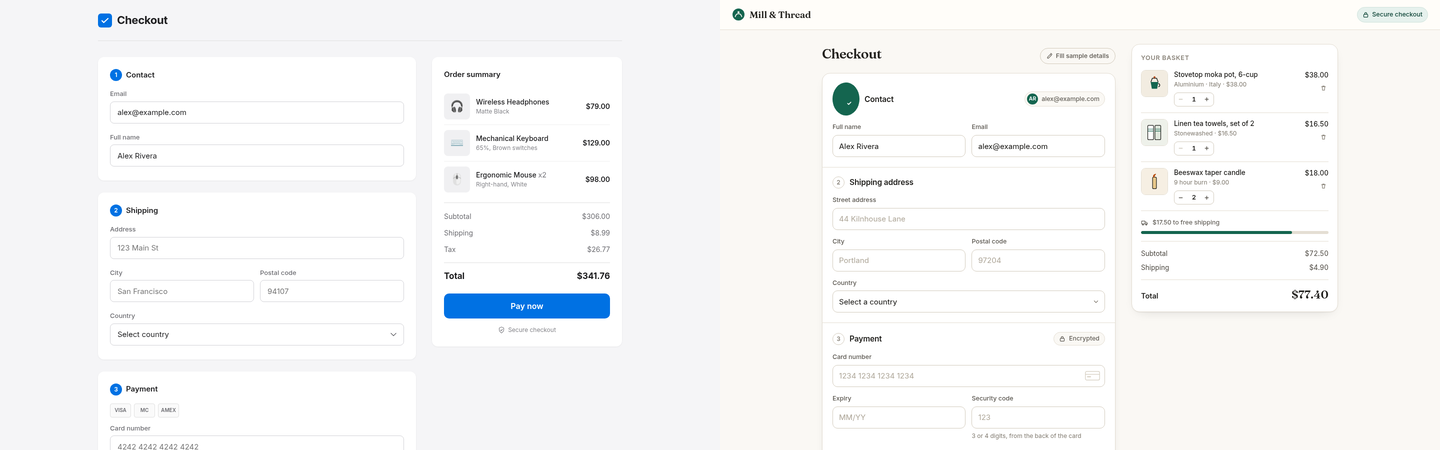
I assumed the yellow style must be opus-4-6 because the icon in the green circle was completely misaligned and i would have expected a “smartass” like opus-5 to get at least that right.
Finding 4: The models fill unspecified gaps with the house style
We didnt give very specific prompts. We asked like a simple user:
We asked three times: “Build a welcome screen for a new user with an empty account”
The model produced entirely different code every time and the design looked 99.8% identical per pixel. (Measured)
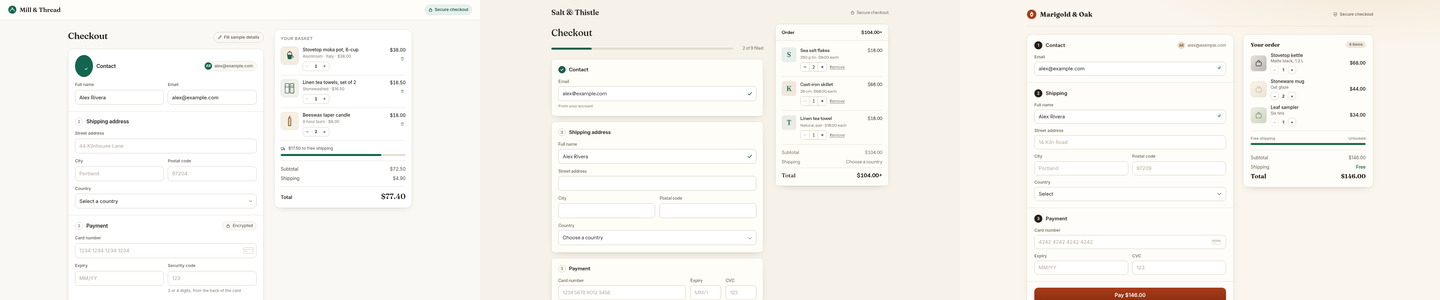
Three separate opus-5 runs of the checkout prompt. It even invented three different shops - Mill & Thread, Salt & Thistle, Marigold & Oak - and gave all three the same design.
The defaults are always the same. Inter font on 35 of 36 apps. Near-white or near-black background, nothing in between. 8px corner radius. Dashboards dark, shops light - both models agree on that without being told.
The handwriting is so stable that the blinding falls apart. A small script that only looks at surface features like background colour and button count guesses the generating model correctly 69% of the time. opus-4-6 used the exact same off-white rgb(248,249,251) on 10 of its 18 apps, across four unrelated app types.
Part of the sameness comes from the study setup itself. The planning model invented the backend shape:
Job = { id, status: "queued" | "running" | "succeeded" | "failed", progress: 0-100 }That shape already dictates the screen: a row per job, a status pill, a progress bar. All six app types shared this one backend, so all apps share a skeleton.
Finding 5: 54 Apps were actually closer to 6
Each model built each app 3 times. Entirely different code, but the final screens are more than 99.8% identical per pixel. It seems opus has a very strong opinion how a login screen “looks” like and steers converges heavily towards that unless you hold it off.
I checked every item below against all six apps of each type - three per model - in a real browser, clicking where the claim needed it. Markers: (*) both models have it, (5) most or all opus-5 apps, (4.6) most or all opus-4-6 apps, (-) absent in both. Not a single item earned a (4.6).
What opus infered the apps should have
…and forgot about.
- (5) := Present in opus-5 designs
- (4.6) := Present in opus-4.6 designs
- (*) := Present in all designs
- (-) := Not present
This is how opus-5 thinks a spreadsheet tool looks like:
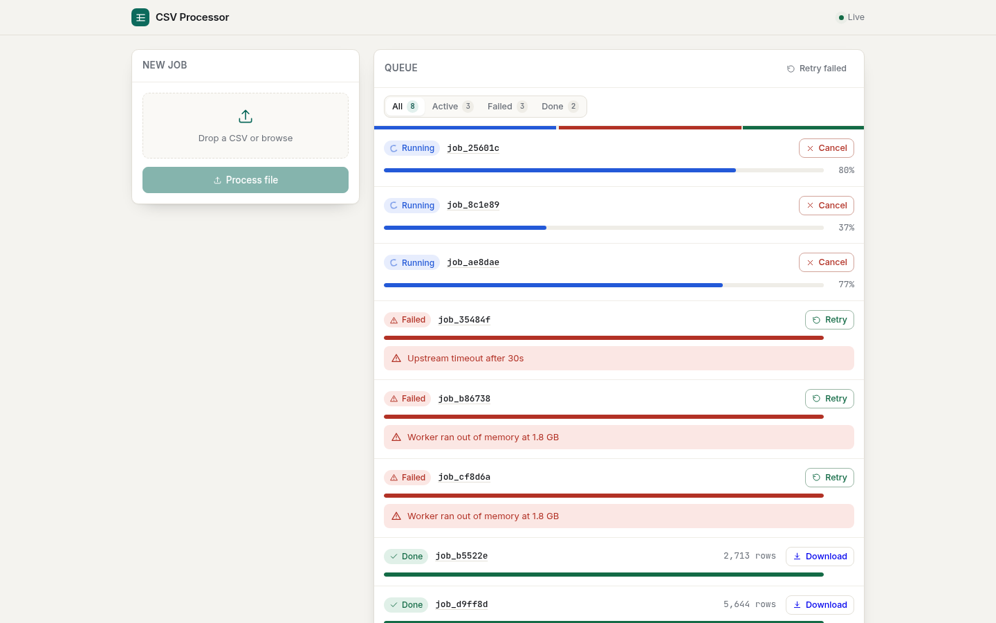
opus-5 thinks a spreadsheet tool has…
- a drag-and-drop upload zone (*)
- a process button that stays disabled until a file is chosen (5) - opus-4-6 skips the button and starts processing on file choice
- status tabs with counts (All / Active / Failed / Done) (5)
- a progress bar with percent on every job, cancel while running (*)
- retry per failed job (*) - the bulk “Retry failed” is only in this one app (-)
- specific error messages (“Worker ran out of memory at 1.8 GB”) (*)
- row counts and a download button on finished jobs (*)
What is missing:
- a preview of the parsed file - columns, first rows - before you hit process. You find out whether it read your file correctly after the job ran (-)
- a validation report: which rows were skipped or changed, and why. “5,644 rows” out is not an answer to “did it eat my data” (-)
- accepted format and size limits stated anywhere (-)
- any way to handle more than a screenful of history: no search, no pagination (-)
This is how opus-5 thinks a job queue looks like:
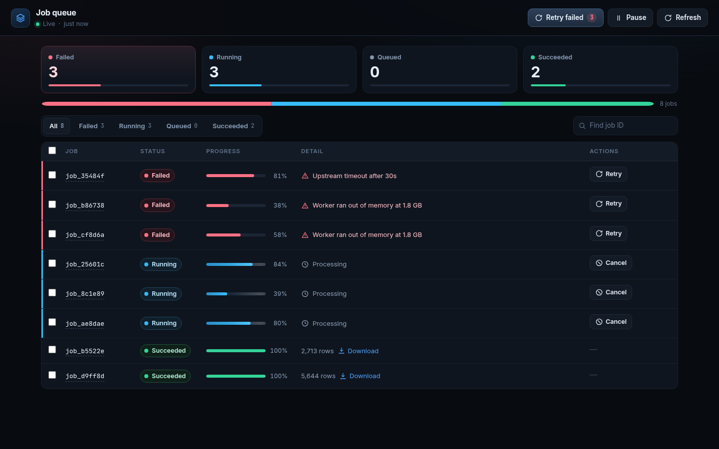
opus-5 thinks a job queue has…
- stat tiles per status (*) plus a stacked ratio bar (5)
- tab filters (*), a “Find job ID” search (5), bulk-select checkboxes only in this one app (-)
- “Retry failed” (5) and Refresh (5) in the header, Pause in one app per model (-)
- per-row progress, specific error text, download links on results (*)
What seems missing by default:
- per-job logs. A row says “Worker ran out of memory at 1.8 GB” and there is nothing to click (-)
- retry semantics: how often was this retried, is there a max, where do jobs go that keep failing (-)
- pagination. 8 jobs fit on the screen, 8000 dont (-)
This is how opus-5 thinks a health dashboard looks like:
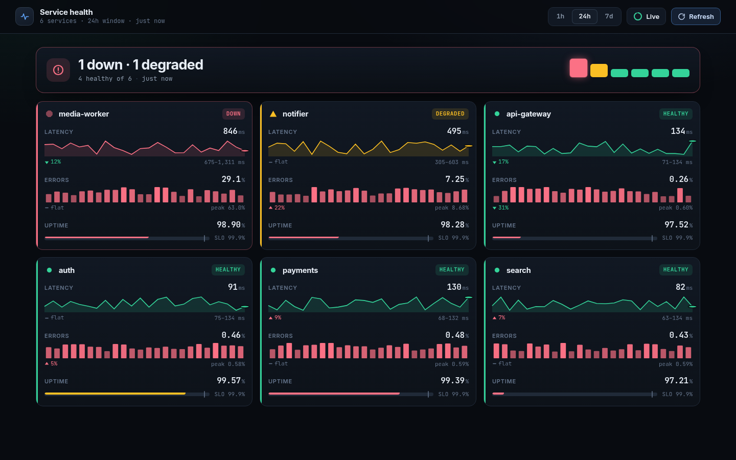
opus-5 thinks a health dashboard has…
- a banner with down/degraded counts (*) - the per-service minimap chips are this app’s own
- a card per service with latency, error and uptime charts (*) - opus-5 draws svg, opus-4-6 draws canvas; the SLO target next to uptime is only in this app
- trend deltas on the metrics (5)
- time range pills (1h / 24h / 7d) (*)
- a Live toggle (5)
What seems missing by default
- every card is a dead end. No link to logs, traces or a runbook - the dashboard tells you media-worker is down and offers nothing to do about it (-)
- deploy markers. “Did the last release cause this” failure? (-)
- acknowledge or mute, incident history, escalation - the entire alerting workflow (-)
And this is how opus-5 thinks a settings page looks like:
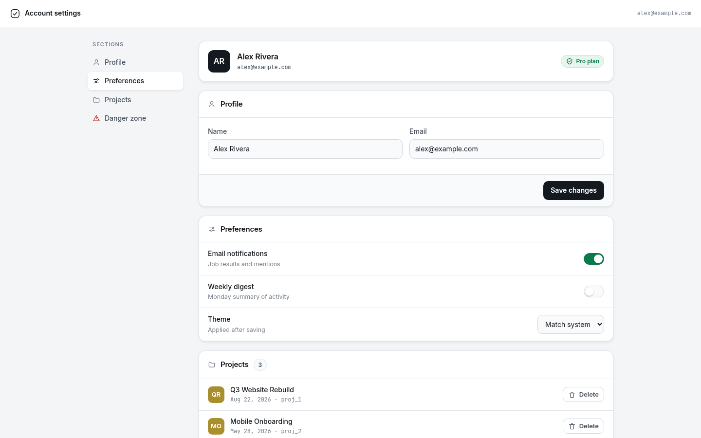
opus-5 thinks an account settings page has…
- a profile card with initials avatar and a plan badge (5)
- name and email with a save button (*)
- notification toggles (5) - opus-4-6 uses dropdowns instead.
- opus-5 wanted to route the dark theme select through the server (5) - unexplainable, i’ve never seen that
- a projects list with per-project delete (5)
- a proper account deletion flow: type-to-confirm plus a warning that it is permanent (*) - both models, all six apps
What is missing by default:
- change password. Not one of the six apps has a password section (-)
- email verification. Type any address, press save, the app accepts it - no confirmation mail, nothing. I tried it in all six (-)
- billing. It shows a “Pro plan” badge but there is no way to manage the plan, cancel it or see an invoice (-)
- export your data before you delete your account (-)
Every item on the missing lists is a (-). The two models disagree about decoration. They agree about what to leave out.
Finding 6: The async question stayed unanswered
Async handling was the reason the apps have a dummy backend with adjustable latency and failure rates. I didn’t feel any notable difference when playing with the apps, while the rater (fable-5) claimed that opus-5 is significantly better. 🙄
But as said in Finding-1 i would rather use a model from a different vendor to rate the code correctness here to get a less biased rating.
So did LLMs get better at UX? Yes and No.
Measurable facts:
- Graphical indicators; 28 -> 49 per page: So the page holds more visually, but that doesn’t mean it is any better.
- Words visible: 70 -> 80
- Screen reader support: 1/18 -> 17/18
- Backend feature coverage: No change
- CSS dead code: 28% for both
- Console errors in all apps: 0 both models
My feeling from that morning discussion was mostly right:
Fewer bugs: yes.
Generic designs: yes, and now i know where they come from. The model fills every gap the prompt leaves open with its defaults, and the defaults are always the same.
Cluttered designs: Yes. Opus-5 only ever adds - 2x the buttons, 2x the visual load, on every app. So if you want lean design with opus-5 reducing the element count is extra effort.
Improved mobile support: No. Both models put about 80% of their controls below the 44px touch minimum. opus-5 just ships twice as many controls, so twice as many that are too small to press now.
Two things i take away for the next run: dont let a model grade its own family. And try to disable the feedback loop when the model can one-shot the task. You get stuff you didn’t ask for and you have to ask for the stuff that you don’t get by default. So knowing both improves my workflow now. (Hopefully)
I published the work behind this here
Cheers